
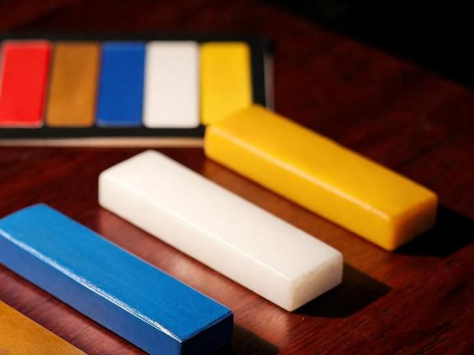
White calligraphy ink sits in an awkward commercial position. It is a genuine line item for calligraphers and painters who work on dark grounds, and at the same time it is the ink most often ordered from a photograph and least often tested before bulk commitment. The result is predictable: buyers approve a swatch, order a container, and discover that the same ink behaves differently depending on the paper and the brush.
What makes white ink different from black ink
Black ink is judged against a single question — how deep and even the tone reads. White ink is judged against a different set: whether it covers, whether it stays white where it lands, and whether it remains visible after it dries.
Coverage is the first issue. A white ink that looks opaque in the bottle can turn translucent once it is drawn thin across an absorbent sheet, and both raw and treated Xuan paper will take it differently. Ask your supplier which surface the ink was evaluated on, because a swatch produced on a low-absorbency card proves little about performance on paper.
The second issue is drying behaviour. Some white inks read brilliantly wet and settle several shades quieter once dry. If your end user finishes a piece and frames it, the colour that matters is the dry one.
Why the carrier matters as much as the pigment
White pigment is dense, and keeping it suspended is the technical problem behind most white ink complaints. In bulk containers the pigment can settle, and a settled bottle may not recover fully even after the buyer shakes it. Practically, that means the ink a customer receives at the end of the container is not always the ink that was tested at the start.
- Settlement and redispersion. Ask whether the ink is designed to redisperse evenly after standing, and over what period.
- Container headspace. Larger containers with more air above the ink can skin or thicken at the surface during a long ocean leg.
- Seal integrity across the route. Vibration and temperature swing during shipping are the usual cause of leakage reported on arrival.
None of these are reasons to avoid white ink. They are reasons to specify it in writing rather than select it from a colour chip.

What to verify before committing to bulk
| Check | What a useful answer looks like | Why it changes the order |
|---|---|---|
| Surface tested on | A named paper type, not "paper" | Absorbency determines whether the ink covers or fades |
| Wet versus dry reading | Both described | Framed and display work is judged on the dry tone |
| Redispersion | A stated interval over which the ink returns to even suspension | Settlement complaints are the main source of returns |
| Pack format | Bottle size, cap type, inner seal | Retail and studio channels need different sizes |
| Set composition | Which colours are grouped together | Set logic drives the shelf price of the line |
Where a white ink is sold as part of a coloured set, the set composition becomes a commercial decision as much as a technical one. A five-colour grouping covers the common painting palette, but a buyer serving a narrow segment may do better with a smaller set built around the two or three colours that actually turn over.
Channel fit: studio, retail and gift
White ink sells into three different situations, and each wants a different pack.
Professional studios buy on behaviour and tend to prefer larger containers they can decant from. They will ask about redispersion and about whether the ink changes character over a long project.
Retail stationery needs a bottle that reads clearly on a shelf, with a size that supports a sensible unit price and a label the customer can understand without guidance. In this channel the pack matters almost as much as the ink.
Gift and cultural programmes buy white ink as a component rather than a standalone product, most often inside a painting set or a four-treasures assortment. Here the question is whether the white sits usefully alongside the other colours in the box, not whether it would be your first-choice standalone SKU.
Questions that get a usable quotation
- Which paper surfaces was this ink evaluated on?
- How does the colour read dry compared with wet?
- Over what interval does the pigment redisperse evenly?
- What container sizes are available, and which caps are used?
- Is the ink offered as a standalone unit or only within a set?
- How is leakage in transit handled if it occurs?
Frequently asked questions
Can white ink be used on the same paper as black ink?
Often yes, but the result differs, because white pigment sits on the surface rather than sinking into it. Test on the exact paper your customer will use; a swatch on a coated card tells you very little about behaviour on Xuan paper.
Why does white ink look different in the bottle and on paper?
Pigment load, binder and the absorbency of the sheet all interact. The bottle shows the ink at full density; the paper shows it drawn thin. Ask for a swatch on a named paper rather than a bottle photograph.
Should white ink be ordered alone or as part of a set?
It depends on the channel. Studios often buy it alone in a larger container. Retail and gift channels usually do better with a set, because white ink alone turns over slowly on a shelf.
How should white ink be stored before resale?
Ask your supplier for the storage conditions that apply to the specific formulation, since settlement and surface behaviour depend on the container and the pigment load rather than on a general rule.
Next step for buyers
Buyers adding white or coloured pigments to a range should compare the Colored Liquid Ink Set against the Colored Hui Ink Stick Set, because the two formats behave differently in storage and in use. Send the surface you expect your customer to paint on, the container size you need and the channel you sell into, and ask for a swatch on that surface rather than a colour chip.